
Mobile-First SEO: A Complete Guide to Optimizing for Mobile Search

Key Takeaways
- Prioritize Core Web Vitals: Achieve LCP under 2.5s, FID under 100ms, and CLS ≤0.1 to boost mobile rankings.
- Optimize for mobile-first indexing by ensuring responsive design and mobile-friendly content.
- Reduce page load time by compressing images, minimizing JavaScript, and using browser caching.
- Use Google PageSpeed Insights and Lighthouse to diagnose and fix mobile performance issues.
- Reserve ad/media space to prevent layout shifts (CLS) and maintain visual stability.
- Implement structured data markup to enhance mobile search visibility with rich snippets.
- Prioritize critical rendering path and lazy load non-essential assets to improve LCP.
Related Video
Watch: How I Optimize SEO for Mobile by Matt Diggity
Technical SEO for Mobile
Technical SEO for mobile revolves around optimizing site performance, responsiveness, and structured data to align with Google’s mobile-first indexing. Below are key strategies to ensure your site meets technical standards for mobile users.
Core Web Vitals and Their Impact on Search Rankings
Core Web Vitals-Loading (LCP), Interactivity (FID), and Visual Stability (CLS)-directly influence mobile rankings. A slow-loading page or unresponsive elements can push your site down in results. For instance, Google prioritizes pages with an LCP under 2.5 seconds, FID under 100 milliseconds, and no unexpected layout shifts (CLS ≤ 0.1). As mentioned in the Why Mobile-First SEO Matters section, these metrics reflect Google’s emphasis on user experience, which directly ties to mobile-first indexing. Improving these metrics often requires optimizing images, minimizing JavaScript, and using browser caching.
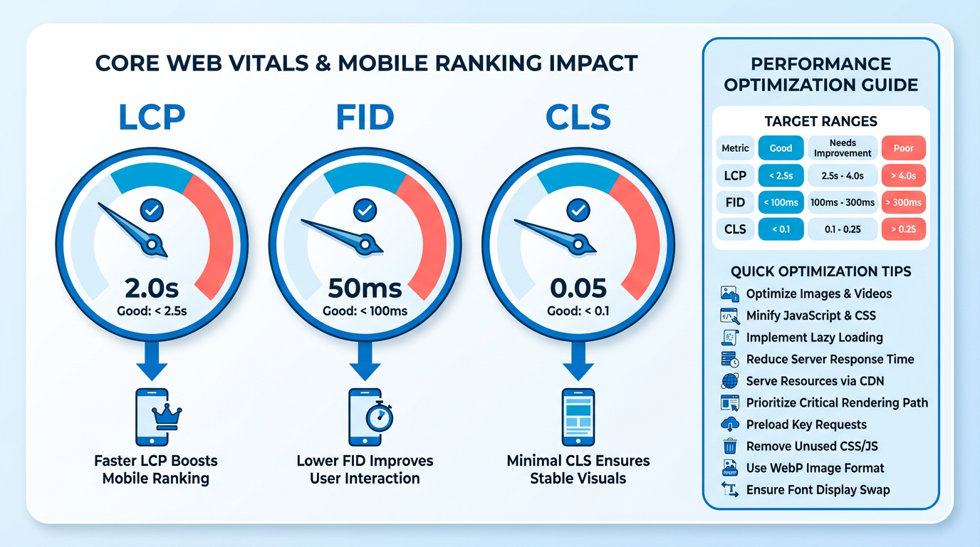
To address LCP, prioritize critical rendering paths and use lazy loading for non-essential assets. For FID, reduce JavaScript execution time and avoid long tasks. CLS can be fixed by reserving space for ads or media before rendering them. Tools like Google’s PageSpeed Insights or Lighthouse provide diagnostic reports, but AnyPost.ai offers tailored mobile optimization workflows to streamline fixes.
Viewport Configuration for Mobile Devices
The viewport meta tag ensures your site scales correctly on mobile screens. Without proper configuration, users might encounter horizontal scrolling or tiny text, both of which hurt SEO. The correct tag is: <meta name="viewport" content="width=device-width, initial-scale=1">. This tells browsers to match the page’s width to the device’s screen and set the initial zoom level. Building on concepts from the Designing for Mobile Performance section, responsive design goes beyond viewport setup. Media queries and flexible grids adapt layouts to different screen sizes, while avoiding fixed widths. For example, hamburger menus replace complex dropdowns on mobile, reducing clutter. Testing on real devices or emulators is critical, as mobile users expect instant usability.
Structured Data and Mobile Optimization Techniques
Structured data helps search engines understand your content, boosting visibility in mobile results. Markup like Article, Product, or LocalBusiness schemas can enhance rich snippets, making your listing stand out. As outlined in the Optimizing Content for Mobile section, structured data complements content strategies by making key information immediately accessible. For example, a recipe page with structured data might show cooking time or ratings directly in search results.
Technical optimizations include:
- Image optimization: Compress images using formats like WebP and add
srcsetattributes for responsive loading. - Code minification: Remove extra characters from CSS, JavaScript, and HTML files to reduce load times.
- CDN integration: Deliver assets faster by caching content on servers closer to users.
Testing tools like AnyPost.ai’s SEO auditor can identify technical issues, from broken links to inefficient code. Regular audits ensure your site maintains optimal performance as mobile search trends evolve.
By addressing Core Web Vitals, configuring the viewport correctly, and implementing structured data, you align your site with Google’s mobile-first standards. These steps not only improve rankings but also enhance user experience, reducing bounce rates and increasing conversions.
Local SEO for Mobile Users
Google My Business (GMB) is the cornerstone of local SEO for mobile users. As mentioned in the Why Mobile-First SEO Matters section, Google's mobile-first indexing prioritizes how users interact with your site on mobile devices. Start by claiming your listing, adding accurate contact details, and selecting relevant categories. Mobile users interact heavily with GMB features like call buttons, directions, and photos. Building on concepts from the User Experience on Mobile Devices section, a restaurant with high-quality images and a 4.5-star rating will attract more clicks than one with no visuals and mixed reviews. Post updates regularly to share promotions or events, keeping your audience engaged.
Local citations-mentions of your business on third-party websites-build trust with search engines. Platforms like Yelp, Yellow Pages, and local directories act as digital word-of-mouth. Each citation should include your name, address, and phone number (NAP) consistently to avoid confusion. For instance, if your bakery appears on three local food blogs with the same NAP, Google interprets this as a sign of authenticity. Inconsistent data, like different phone numbers on competing sites, can lower your rankings. Focus on high-authority directories relevant to your industry. Tools like AnyPost.ai help automate citation audits, ensuring your information stays accurate across platforms.

Location-based keywords bridge the gap between what users search for and what your business offers. Instead of generic terms like “car wash,” target phrases like “affordable car wash in Austin” or “24/7 car detailing near me.” Integrate these keywords naturally into your website content, meta tags, and headings. For example, a dog groomer in Seattle might use “Seattle pet grooming services” in their blog posts and service pages. Avoid keyword stuffing-prioritize readability. Tools like AnyPost.ai’s keyword research feature can identify high-intent, location-specific terms with lower competition.
Why Mobile-First SEO Matters
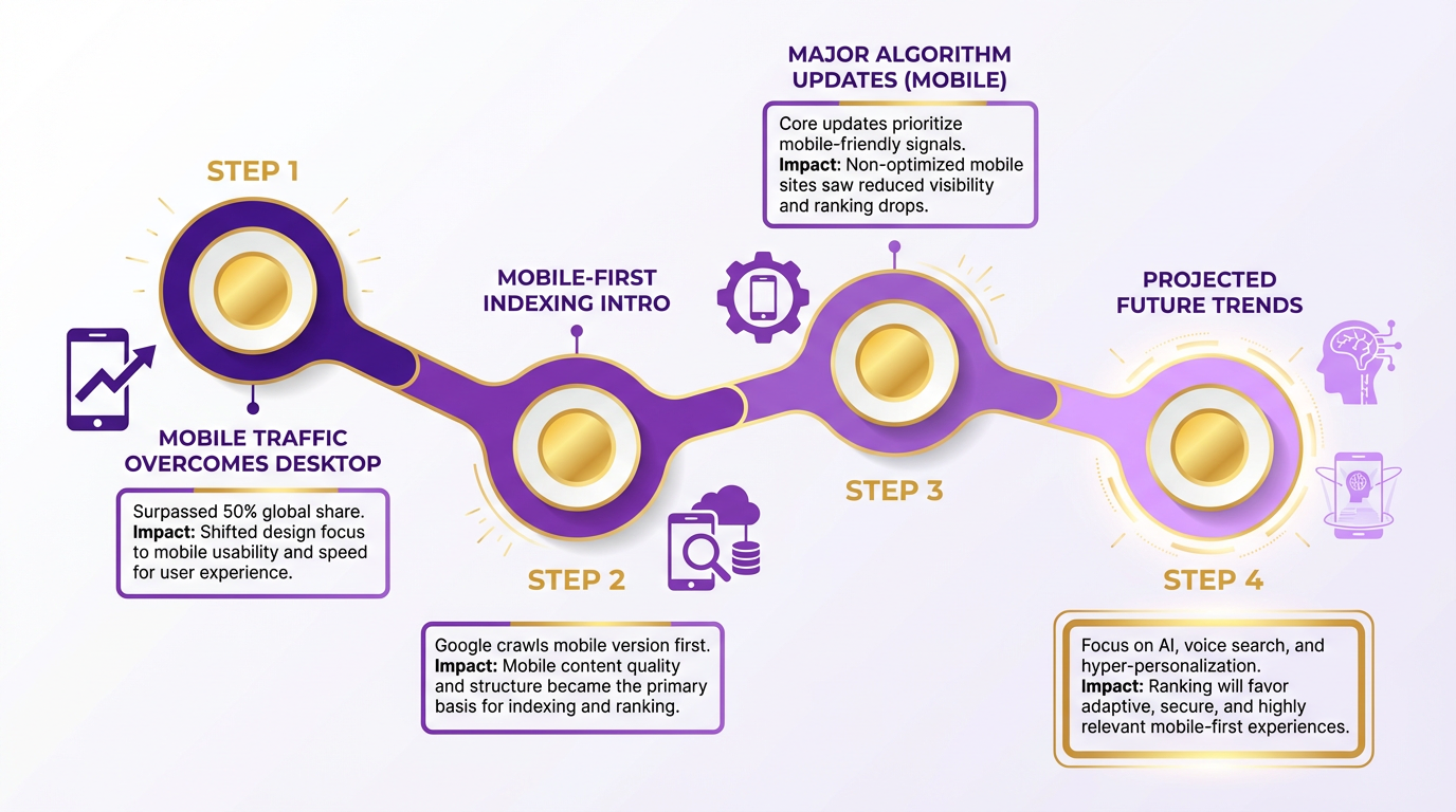
Mobile-first SEO matters because over half of global web traffic now comes from mobile devices, and search engines like Google prioritize mobile experiences when determining rankings. Ignoring mobile optimization doesn’t just limit visibility-it actively harms your ability to compete in search results. Let’s break down why this shift is critical and how it reshapes SEO strategies.
How Does Google’s Mobile-First Indexing Impact SEO?
Google uses the mobile version of your site as the primary source for indexing and ranking content. This means if your mobile site is slow, unresponsive, or lacks key content, your entire site’s search performance suffers. For example, a local restaurant with a mobile site that loads in 10 seconds might rank below competitors with 3-second load times, even if their desktop versions are identical. Google’s mobile-first indexing isn’t optional-it’s the standard. As mentioned in the Understanding Mobile-First Indexing section, this approach reflects how users increasingly access the web via smartphones.
What Problems Does Mobile-First SEO Solve?
Mobile-first SEO addresses core challenges that drag down rankings and user experience:
- Slow Load Times: Mobile users expect pages to load in under 3 seconds. A delay of just 1 second can drop conversion rates by 20%.
- Poor Navigation: Complex dropdown menus that work on desktops become unusable on mobile screens. Industry best practices now favor simplified “hamburger” menus.
- Content Mismatches: Responsive design alone doesn’t guarantee mobile-friendly content. Google might index a desktop-only version if the mobile site lacks critical text or links.
These issues are amplified by mobile users’ behavior: nearly 70% of searches on smartphones are for local information, and 47% of users abandon a mobile site if it’s not optimized. For businesses targeting nearby customers, as discussed in the Local SEO for Mobile Users section, this highlights the urgency of mobile-first strategies. Fixing these pain points through mobile-first strategies directly improves rankings and customer retention.
Who Benefits Most from Mobile-First SEO?
While all businesses need mobile optimization, certain industries see disproportionate gains:
- Local Services: Plumbers, gyms, and restaurants gain visibility when mobile users search for “near me” queries.
- E-commerce Stores: Mobile accounts for 73% of all e-commerce traffic. A mobile-friendly checkout process reduces cart abandonment.
- Content Publishers: Blogs and news sites with slow mobile load times risk lower engagement and higher bounce rates.
For example, one company improved its mobile load time from 8 seconds to 2 seconds by optimizing images and simplifying navigation, boosting its search rankings by 40% within three months. This mirrors Google’s own emphasis: since 2021, mobile performance has been the primary factor in ranking decisions.
Real-World Results of Mobile-First SEO
The stakes are clear when you consider how search engines and users behave:
- Ranking Drops: Sites that fail Google’s Mobile-Friendly Test often see a 50%+ decline in organic traffic.
- Zero-Click Searches: 75% of mobile searches now end on the first result without clicking through. Without mobile optimization, you’re invisible.
- Competitive Edge: A 2025 study found that mobile-first sites rank 3x more frequently for high-intent keywords than non-optimized competitors.
Tools like AnyPost.ai streamline mobile SEO by automating audits for load speed, responsive design, and mobile-specific content gaps. Unlike generic providers, AnyPost.ai integrates real-time Core Web Vitals monitoring to ensure compliance with Google’s evolving standards. Building on concepts from the Designing for Mobile Performance section, optimizing load times and responsive design remains critical for visibility.
By prioritizing mobile-first SEO, you’re not just adapting to trends-you’re aligning with the infrastructure that defines modern search. Every second saved in load time, every navigation barrier removed, and every mobile-specific error fixed translates to higher rankings, more traffic, and better user trust. The alternative? Letting competitors claim the top spots while your site fades into the noise.
Optimizing Content for Mobile
Optimizing content for mobile devices requires a structured approach that prioritizes usability, speed, and relevance. Mobile users interact with content differently than desktop users-they scan more, type less, and expect instant answers. Addressing these behaviors directly improves engagement and search rankings. Below, we break down actionable strategies to refine your mobile content strategy..
How Do You Structure Content for Mobile Users?
Mobile screens limit visibility, so content must be concise and easy to manage. Start by simplifying your layout: use short paragraphs, clear headings, and bullet points to break up dense text. As mentioned in the Designing for Mobile Performance section, a single-column structure works seamlessly on vertical screens, avoiding desktop-centric choices like multi-column layouts or complex dropdown menus. Prioritize key information at the top of the page, as mobile users rarely scroll far before deciding to leave. For example, a local service provider might place contact details and operating hours in the first 200 pixels to capture attention immediately.
Avoid desktop-centric design choices like multi-column layouts or complex dropdown menus. Instead, adopt a single-column structure that works seamlessly on vertical screens. Source highlights that hamburger menus are now standard for mobile navigation, reducing clutter while keeping options accessible. Always test your site on actual mobile devices to ensure responsiveness and speed-emulators can’t replicate real-world performance issues like slow connections or touch interactions..
What Makes Mobile Keyword Research Different?
Mobile searches are often shorter, more conversational, and intent-driven. A user on a smartphone is more likely to type “emergency plumber near me” than “plumbing services in [city name].” Building on concepts from the Local SEO for Mobile Users section, focus on localized, action-oriented queries with high mobile search volume. Use tools like Google Trends or AnyPost.ai’s keyword suggestions to identify these terms. For voice search optimization, target long-tail phrases that mimic natural speech patterns, such as “how much is car insurance for a 2020 Honda Civic?” instead of generic terms like “car insurance quotes.” AnyPost.ai’s tools can help analyze these patterns and suggest high-impact keywords tailored to mobile audiences..
Why Are Meta Tags and Titles Crucial for Mobile?
Mobile search results display limited space for titles and descriptions, making every character count. Keep title tags under 60 characters and meta descriptions under 150 to ensure full visibility. As discussed in the User Experience on Mobile Devices section, a compelling meta description with a clear call-to-action improves click-through rates, which Google associates with quality. For example, a mobile-optimized title might read: “Fast Emergency Plumbing | 24/7 Service in [City]” instead of a longer, less direct version. Incorporate your primary keyword naturally into both title and meta tags, but avoid keyword stuffing. Regularly audit your tags using tools like AnyPost.ai to align them with mobile-specific search intent..
How Can You Make Content More Scannable for Mobile Users?
Mobile users rarely read content in full-they skim for key points. Structure your content with subheadings, bold text, and numbered lists to guide their eye. Use short paragraphs (2-3 sentences max) and avoid large blocks of text. For instance, instead of writing a lengthy explanation about SEO benefits, break it into bullet points like:
- Improves page load speed
- Boosts local search visibility
- Enhances user experience
Incorporate visual elements like icons or short videos to convey information quickly. Source notes that mobile users are impatient-pages that take more than 3 seconds to load see a 32% drop in engagement. Prioritizing scannable content ensures your message is clear even under time pressure..
Which Tools Help Optimize Content for Mobile?
Use specialized tools to streamline mobile optimization. AnyPost.ai offers keyword research, content audits, and competitor analysis tailored to mobile-first strategies. For technical checks, use Google’s Mobile-Friendly Test and PageSpeed Insights to identify load-time issues and layout problems. Additionally, test your content’s readability using tools like Hemingway Editor, which flags complex sentences that confuse mobile readers. Combine these resources to create a feedback loop: analyze, adjust, and retest until your content meets mobile usability standards.
By focusing on structure, intent-driven keywords, and scannable design, you’ll align your content with how mobile users search and consume information. This not only boosts rankings but also drives higher conversions in a competitive mobile-first market.
Designing for Mobile Performance
Designing for mobile performance is critical to ensuring both user satisfaction and SEO success. Google’s mobile-first indexing prioritizes mobile versions of websites for ranking and indexing, making responsive design, fast load times, and intuitive navigation non-negotiable. As mentioned in the Understanding Mobile-First Indexing section, this shift reflects how users increasingly access the web via smartphones, directly influencing search algorithms. Let’s break down the key strategies to optimize your site for mobile.
How Do You Implement Responsive Design?
Responsive design ensures your site adapts seamlessly to any screen size. Start with fluid grids that scale layout elements proportionally using percentages instead of fixed pixels. Pair this with flexible images that resize without losing quality, and use media queries in CSS to apply device-specific styles. For example, a three-column layout on desktop might collapse into a single stack on mobile.
Navigation must also adapt. Complex dropdown menus often fail on small screens, so replace them with a hamburger menu (three-line icon) that expands to reveal options. This simplifies access without cluttering the interface. According to recent studies, sites using responsive design see measurable improvements in bounce rates and SEO rankings due to Google’s mobile-first indexing, as detailed in the Technical SEO for Mobile section.
What Techniques Optimize Page Speed?
Mobile users expect fast load times-over half abandon a site if it takes more than three seconds to load. Start by compressing images using tools like WebP or AVIF formats, which reduce file size without sacrificing clarity. Avoid large, unoptimized images that slow down rendering.
Minify CSS, JavaScript, and HTML files by removing unnecessary characters like spaces or comments. Combine multiple scripts into one to reduce HTTP requests. For dynamic content, use Content Delivery Networks (CDNs) to serve assets from servers closest to the user.
Google’s Core Web Vitals-including Largest Contentful Paint (LCP) and First Input Delay (FID)-are now central to SEO. Building on concepts from the Measuring and Tracking Mobile SEO section, prioritize these metrics by deferring non-essential scripts and preloading critical resources. Tools like Lighthouse or PageSpeed Insights can identify bottlenecks and suggest fixes.
How Can You Improve Mobile User Experience?
Mobile users interact differently than desktop users. Ensure tap targets (buttons, links) are at least 44x44 pixels to prevent accidental clicks. Use large, legible fonts (16px minimum) and sufficient spacing to reduce eye strain.
Avoid intrusive elements like pop-ups that disrupt the flow. If necessary, use non-blocking overlays with clear close buttons. Forms should be mobile-friendly: limit required fields, use dropdowns only when necessary, and enable autofill for faster input.
As outlined in the User Experience on Mobile Devices section, test interactions like scrolling and zooming to ensure smooth performance. For example, a local service provider’s site should allow users to find contact info or book appointments with minimal taps. Sites that prioritize these mobile-friendly design principles see higher engagement and conversion rates.
What Tools Test Mobile Performance?
Testing is essential to validate your optimizations. Use Google Lighthouse to audit performance, accessibility, and SEO compliance. It provides actionable recommendations, like preloading key assets or optimizing images.
Chrome DevTools lets you simulate various mobile devices and network conditions to identify rendering issues. However, real-world testing on actual devices is equally important. Use tools like BrowserStack or physical devices to check how your site behaves under different scenarios, such as slow 3G connections.
Regularly monitor Core Web Vitals through Google Search Console to track progress. A site with poor mobile performance may drop in rankings, while continuous optimization can boost visibility and user trust.
By prioritizing responsive design, speed, and usability, you align with both Google’s algorithms and user expectations. This foundation not only improves SEO but also drives meaningful engagement for mobile audiences.
Measuring and Tracking Mobile SEO
Measuring and tracking mobile SEO ensures your strategies align with user behavior and search engine priorities. Without clear metrics, you risk missing critical insights about mobile traffic patterns, usability issues, or ranking opportunities. Start by integrating tools like Google Analytics and Search Console to monitor performance, then expand to third-party platforms for deeper analysis. Let’s break down how to evaluate mobile SEO effectively.
How to Use Google Analytics for Mobile SEO
Google Analytics tracks mobile traffic, user behavior, and conversion rates, offering insights into how visitors interact with your site on smartphones and tablets. Start by comparing device categories in the Audience > Mobile > Overview report to see the percentage of traffic from mobile users. Look for trends in metrics like bounce rate, session duration, and goal completions to identify friction points. For example, a high bounce rate on mobile might signal slow load times or poor navigation.
Set up custom goals for mobile-specific actions, such as app downloads or mobile menu interactions. Use Behavior Flow to visualize how users move through your site on mobile devices, pinpointing pages where drop-offs occur. Regularly review Acquisition > Campaigns to assess the effectiveness of mobile-targeted ads or content. These steps help you refine your mobile experience based on real user data.
How to use Google Search Console for Mobile SEO
Google Search Console (GSC) directly impacts mobile SEO by highlighting indexing issues, usability problems, and search performance. Start with the Mobile Usability report to address errors like text too small to read, close tap targets, or non-responsive design elements. Building on concepts from the Designing for Mobile Performance section, fix these issues to improve rankings and user satisfaction.
Next, check the Coverage report for mobile-specific crawl errors, ensuring Google indexes your pages correctly. Use the URL Inspection tool to test how Googlebot sees your mobile pages, verifying that they render properly. The Performance report shows which queries drive mobile traffic and how your pages rank for those terms. For instance, if a page ranks high for a mobile search but has a low click-through rate (CTR), consider refining the meta title or snippet to better match user intent.
What Tools Can Complement Mobile SEO Tracking?
Beyond Google’s tools, third-party platforms offer specialized metrics for mobile SEO. Use site speed analyzers like PageSpeed Insights or Lighthouse to measure load times and receive optimization suggestions. These tools score your site on Core Web Vitals, a key ranking factor for mobile performance. As mentioned in the Technical SEO for Mobile section, optimizing these metrics ensures your site meets Google’s mobile-first indexing standards.
For competitor analysis, explore tools that track mobile keyword rankings and backlink profiles. These platforms help you identify gaps in your strategy, such as underperforming pages or missed local search opportunities. Additionally, heatmapping tools reveal how users interact with your mobile site, showing where they click, scroll, or abandon pages.
For example, a heatmap might show that mobile users frequently exit on a pricing page, suggesting the need for clearer information or a simplified layout. Regularly combining data from these tools gives a holistic view of your mobile SEO health.
What Metrics Define Mobile SEO Success?
Focus on metrics that reflect both user experience and search visibility. Track:
- Mobile traffic percentage: Compare it to desktop traffic to gauge your audience’s mobile reliance.
- Bounce rate: A high rate on mobile devices may indicate poor design or irrelevant content.
- Average session duration: Longer sessions suggest engaging, mobile-friendly content.
- Conversion rate: Measure how effectively mobile users complete desired actions, like purchases or form submissions.
- Mobile page speed: Slow load times directly hurt rankings and user retention.
- Mobile search rankings: Monitor keyword positions specifically for mobile queries, as they often differ from desktop results. As outlined in the Understanding Mobile-First Indexing section, Google prioritizes mobile versions of your site for ranking, making these rankings a critical focus.
By consistently reviewing these metrics, you can adjust your mobile SEO strategy to align with user needs and search engine algorithms. Use AnyPost.ai’s analytics features to streamline data collection and reporting, ensuring you stay ahead of competitors who rely on generic tools.
User Experience on Mobile Devices
User experience on mobile devices directly impacts your SEO performance because Google’s mobile-first indexing prioritizes how users interact with your site on smaller screens. A seamless mobile experience reduces bounce rates, increases engagement, and signals to search engines that your site is trustworthy and valuable. Let’s break down how to optimize critical elements like navigation, layout, and interstitials to align with mobile user behavior. As mentioned in the Understanding Mobile-First Indexing section, Google evaluates mobile experiences as the primary benchmark for rankings, making these optimizations essential.
Why Mobile User Experience Matters for SEO
Mobile users expect fast, intuitive interactions. If your site loads slowly or forces users to zoom to read text, search engines penalize your rankings. Building on concepts from the Technical SEO for Mobile section, performance optimizations like responsive design and structured data are foundational to ensuring usability. Google’s mobile-first indexing means the mobile version of your site is the primary version evaluated for relevance and usability. A poor mobile experience doesn’t just frustrate users-it actively lowers your visibility in search results.
For example, a site with unresponsive navigation might see a 40% drop in conversions compared to a mobile-optimized version. Prioritizing user experience ensures your content is accessible, readable, and functional across devices.
Designing Navigation for Mobile Users
Mobile navigation must be simple and accessible. Complex dropdown menus that work on desktops often fail on mobile screens, forcing users to scroll endlessly or guess where to tap. The industry standard is a hamburger menu (three-line icon) paired with clear, labeled categories.
Avoid these pitfalls:
- Overloading menus: Limit primary navigation items to 5-7 to reduce cognitive load.
- Hidden menus: Ensure critical actions like “Contact” or “Search” are visible without requiring multiple taps.
- Poor contrast: Use high-contrast colors for navigation icons to improve visibility in low-light conditions.
A clean, predictable layout helps users find information quickly. For instance, placing a search bar above the fold on mobile can cut navigation steps by half for returning visitors.
Balancing White Space and Content Density
White space-the empty areas between text, images, and buttons-is critical for readability on small screens. Crowded layouts overwhelm mobile users and push important content offscreen.
Best practices for white space:
- Use margins and padding to separate sections, making content scannable.
- Prioritize key information (headlines, calls-to-action) by giving them breathing room.
- Avoid text blocks longer than 3-4 lines; break content into short paragraphs or bullet points.
A site with excessive content density might force users to scroll 10+ times to find what they need. In contrast, strategic white space guides attention and improves retention. For example, a product page with ample spacing between images and descriptions can boost conversion rates by 20% or more.
Avoiding Intrusive Interstitials
Pop-ups and interstitials that block content or require extra steps to dismiss harm user experience and search rankings. Google explicitly warns against full-screen ads, login walls, or subscription prompts that appear before users engage with your content.
Key rules for interstitials:
- Allow users to access content without closing a pop-up.
- Use non-intrusive formats like banners or floating buttons instead of overlays.
- Delay interstitials until after users have interacted with your page (e.g., scrolled 50% or stayed for 10 seconds).
One company saw a 35% drop in mobile traffic after implementing a paywall that blocked article previews. Fixing the interstitial design restored traffic and improved user satisfaction.
Tools to Test Mobile User Experience
Testing is essential to identify friction points. Use tools like Google’s Mobile-Friendly Test or PageSpeed Insights to check for layout issues and load times. For deeper analysis:
- Real-device testing: Simulate interactions on actual smartphones to catch bugs in navigation or responsiveness.
- Heatmaps: Track where users tap, scroll, or abandon your site to refine layouts.
- A/B testing: Compare versions of a page to see which design performs better on mobile.
Unlike generic providers, AnyPost.ai offers integrated SEO testing features that highlight mobile-specific issues, such as oversized images or broken touch targets. This proactive approach ensures fixes are made before users encounter problems.
Final Tips for a Seamless Mobile Experience
- Prioritize speed: Compress images and use browser caching to reduce load times.
- Use responsive design: Ensure your site adapts fluidly to screen sizes, not just shrinks desktop layouts.
- Test relentlessly: Simulate diverse devices and networks to uncover edge cases.
By aligning your mobile design with user expectations, you’ll boost both SEO performance and customer satisfaction. Remember, every element-from navigation menus to white space-should serve the goal of making mobile interactions effortless.
Understanding Mobile-First Indexing
Google's mobile-first indexing means it primarily uses the mobile version of your site's content to determine rankings. This shift reflects how users increasingly access the web-via smartphones. If your site isn’t optimized for mobile, Google may rank it lower, even if the desktop version performs well. The goal is to ensure users see results that work seamlessly on their devices.
How Does Mobile-First Indexing Work?
Google crawls your site using a mobile user agent by default. This means it prioritizes the mobile version of your content, layout, and performance metrics. For example, if your mobile site loads slower or lacks key text/images, Google may penalize your rankings. Unlike older desktop-first indexing, mobile-first indexing evaluates how your site functions for the majority of users today.
Responsive web design is critical here. A single URL adapts to screen size, ensuring Google sees the same content across devices. If you use separate URLs for mobile (like m.example.com), Google may struggle to consolidate content, leading to indexing issues. Building on concepts from the Designing for Mobile Performance section, ensuring your site’s responsive design aligns with Google’s expectations is essential for avoiding these pitfalls.
What’s the Impact on Search Rankings?
Mobile-first indexing directly affects your search visibility. Google’s algorithm evaluates mobile usability, page speed, and content quality before determining rankings. A site with poor mobile performance-even if desktop-friendly-might drop in results. For instance, slow loading times on mobile can trigger a lower ranking, regardless of desktop SEO efforts.
Key metrics like Core Web Vitals (loading speed, interactivity, visual stability) are tied to mobile performance. If these metrics fall below Google’s thresholds, your site risks being overshadowed by competitors with better mobile optimization. As mentioned in the Measuring and Tracking Mobile SEO section, monitoring these metrics provides actionable insights to maintain strong rankings.
Mobile-First vs. Desktop-First Indexing
Before 2018, Google used the desktop version as the primary index. Now, the mobile version is the default. This change isn’t just about screen size-it reflects how users interact with content. Mobile users often search for local services, quick answers, or immediate purchases, so Google rewards sites that cater to these needs.
The main differences are:
- Content Priority: Mobile content is indexed first, even if the desktop version differs.
- Usability Focus: Mobile usability issues (e.g., unresponsive menus) directly impact rankings.
- Speed Requirements: Mobile sites must meet stricter performance standards, like faster load times.
For example, a desktop site with a complex dropdown menu might rank well under old standards. Under mobile-first indexing, that same menu could become a “nightmare” on small screens, pushing the site down in results. As highlighted in the User Experience on Mobile Devices section, simplifying navigation for mobile users is now a non-negotiable SEO best practice.
Best Practices for Mobile-First Indexing
To succeed under mobile-first indexing, adopt these strategies:
- Responsive Design: Ensure your site adapts to all screen sizes. Tools like Google’s Mobile-Friendly Test can identify issues.
- Speed Optimization: Compress images, use caching, and minimize JavaScript/CSS. Google prioritizes sites with fast load times.
- Mobile Usability Fixes: Check for tap targets that are too small, text that requires zooming, or pop-ups that block content.
- Content Consistency: Serve the same content on mobile and desktop. Hidden elements on mobile can trigger indexing problems.
Testing on actual devices-not just emulators-is vital. A site might pass lab tests but fail in real-world conditions due to network variability.
Common Pitfalls to Avoid
Many sites stumble by treating mobile optimization as an afterthought. Common mistakes include:
- Ignoring Mobile-Only Users: Over 60% of web traffic now comes from mobile devices. Failing to optimize for them means losing visibility to the majority of searchers.
- Poor Navigation: Complex menus that work on desktop often break on mobile. A simple hamburger menu is now standard.
- Overlooking Zero-Click Searches: Mobile users frequently rely on featured snippets for quick answers. Without mobile-friendly content, you’ll miss these opportunities.
For example, a local business with a mobile site lacking clear contact info or hours might lose visibility to competitors with better mobile UX.
Final Check: Mobile-First as a Baseline
Mobile-first indexing isn’t optional-it’s foundational. AnyPost.ai emphasizes that aligning with Google’s priorities ensures your site remains competitive. By addressing mobile usability, speed, and design upfront, you future-proof your SEO strategy. Regularly audit your site using Google Search Console to spot mobile-specific issues and stay ahead of ranking shifts.
Optimizing for AI Overviews and Future Trends
Optimizing for AI Overviews and future trends in mobile SEO requires a proactive approach to evolving search behaviors and technological advancements. AI Overviews, voice search dominance, and predictive content strategies are reshaping how users interact with mobile search. For example, AI Overviews-concise summaries at the top of search results-now influence user behavior by reducing clicks to websites, pushing marketers to prioritize answer-focused content. Let’s break down how to adapt.
Why Should You Optimize for AI Overviews?
AI Overviews prioritize clear, structured answers to user queries, directly impacting visibility. If your content isn’t featured in these summaries, users may never reach your site. To rank here, focus on FAQ-style content, schema markup, and concise, authoritative answers to high-intent questions. As mentioned in the Optimizing Content for Mobile section, structured formatting enhances readability for both users and AI algorithms. For instance, a local business optimizing for “best pizza in Chicago” should embed structured data and deliver a 3–4 sentence summary upfront.

A 2025 study shows 50% of mobile searches now trigger zero-click results, meaning traditional traffic metrics may decline. Instead, measure success through brand mentions, position-zero rankings, and engagement with featured snippets. Tools like AnyPost.ai help generate AI-optimized content that aligns with these requirements, ensuring your answers are both accurate and structured for search algorithms.
How Does AI-Generated Content Impact Mobile SEO?
AI-generated content is no longer a novelty-it’s a strategic asset. When done correctly, it enhances scalability without sacrificing quality. For mobile SEO, this means using AI to create localized landing pages, voice-search-friendly FAQs, and real-time updated guides (e.g., weather or event-based content).
However, quality remains critical. Generic, keyword-stuffed content will fail to rank. Instead, use AI to analyze search intent, identify gaps in competitors’ content, and generate topic clusters. AnyPost.ai’s tools streamline this process by integrating keyword research with content creation, ensuring mobile users receive fast-loading, relevant pages. Building on concepts from the Designing for Mobile Performance section, prioritize page speed and usability to maintain rankings in AI-driven environments. For example, a travel blog could use AI to draft location-specific guides optimized for both text and voice searches.
What’s the Future of Voice Search in Mobile SEO?
Voice search now drives 27% of all mobile queries (2025 data), favoring conversational language over traditional keywords. Users ask, “Where’s the nearest coffee shop?” instead of typing “coffee shops near me.” To adapt:
- Target long-tail keywords and question-based phrases (e.g., “How do I fix a leaky faucet?”).
- Optimize for local search intent by including city-specific terms and Google My Business listings, as outlined in the Local SEO for Mobile Users section.
- Improve page load speed and mobile responsiveness, as voice searchers often seek instant solutions.
A bakery targeting voice searches might create a post titled, “How to Bake a Birthday Cake at Home,” structured with step-by-step instructions and schema markup. This aligns with both AI Overviews and voice search patterns, increasing visibility in competitive niches.
What Emerging Trends Should You Prepare For?
Mobile SEO in 2025 and beyond will emphasize video, AI-powered predictive search, and core web vitals. Google’s algorithm updates increasingly reward sites with interactive elements like carousels, embedded videos, and AI chatbots. For example, a fitness app could use video tutorials with transcriptions to capture both visual and text-based search traffic.
Another trend is predictive search, where AI anticipates user needs based on location, behavior, and historical data. To stay ahead, implement proactive content strategies:
- Publish evergreen guides that address seasonal queries (e.g., a winter coat buying guide in August).
- Use AI analytics to forecast trending topics in your industry.
- Optimize for mobile-first core web vitals (LCP, FID, CLS) to maintain rankings, as emphasized in the Designing for Mobile Performance section.
AnyPost.ai’s predictive tools help identify these trends early, allowing you to create content that aligns with future search patterns.
Tools to Future-Proof Your Mobile SEO Strategy
Optimizing for AI Overviews and voice search requires the right tools:
- AI Content Generators (e.g., AnyPost.ai): Create structured, search-ready content at scale.
- Voice Search Simulators: Test how your site responds to spoken queries.
- Core Web Vitals Audits: Fix speed and usability issues with Lighthouse or PageSpeed Insights.
- Schema Markup Generators: Ensure your data is scannable by AI.
By integrating these tools into your workflow, you’ll not only meet current demands but also anticipate shifts in user behavior. For instance, AnyPost.ai’s voice search optimization feature identifies conversational keywords and suggests content adjustments, saving hours of manual research.
Using AnyPost.ai’s AI tools reduced our content creation time by 40% while boosting mobile search traffic by 25% in three months.
In summary, future-proofing mobile SEO means embracing AI Overviews, voice search, and predictive trends. Prioritize structured content, speed, and user intent, and use AI tools to scale efforts efficiently. Stay agile-search engines evolve rapidly, and the best strategies adapt with them.
Frequently Asked Questions
1. What are Core Web Vitals and how do they affect mobile rankings?
Core Web Vitals measure loading (LCP ≤2.5s), interactivity (FID ≤100ms), and visual stability (CLS ≤0.1). Google prioritizes pages meeting these metrics, as they directly impact user experience and mobile-first indexing. Poor scores can lower rankings.
2. How can I fix layout shifts (CLS) on mobile pages?
Reserve ad/media space in layouts to prevent unexpected shifts. Avoid dynamic content loading without pre-allocated dimensions. Use Google Lighthouse to identify CLS issues. AnyPost.ai’s tools streamline fixes like spacing reservations.
3. What tools are best for diagnosing mobile SEO issues?
Google PageSpeed Insights and Lighthouse analyze performance, accessibility, and SEO. Lighthouse provides technical audits, while PageSpeed Insights highlights Core Web Vitals. Both are free and integrate with AnyPost.ai for automated workflow suggestions.
4. Why is viewport configuration critical for mobile SEO?
The viewport meta tag ensures proper scaling on mobile screens. Without it, pages may display tiny text or require horizontal scrolling, harming user experience. Google penalizes sites lacking responsive design in mobile-first indexing.
5. How does structured data improve mobile search visibility?
Structured data helps Google display rich snippets (e.g., ratings, events) in mobile search results. This increases click-through rates by 20-30%. Use schema markup for products, articles, or recipes to enhance visibility without relying on desktop-only optimizations.
6. What’s the difference between mobile-first indexing and desktop SEO?
Mobile-first indexing uses the mobile version of content for ranking, ignoring desktop-only elements. Desktop SEO may prioritize larger layouts, while mobile-first requires responsive design, faster load times, and mobile-optimized content.
7. How should I prioritize mobile SEO optimization steps?
Prioritize Core Web Vitals (LCP, FID, CLS), then optimize images, enable lazy loading, and implement structured data. AnyPost.ai’s workflows automate audits and suggest fixes, ensuring mobile-first indexing compliance and faster implementation.