
Customized Reporting for Content Optimization Across Blogs, Newsletters, and Social Channels

Key Takeaways
- A content marketing dashboard pulls website analytics, social platforms, SEO tools, email marketing, and your CRM into one source of truth.
- Attribution stages roll each channel's native metrics up to three shared outcomes—traffic, leads, and sales—so a blog and an email campaign can be compared on the same terms.
- Good per-channel KPIs stay narrow: blogs track organic traffic, time on page, and conversion rate; newsletters watch open rate, click-through rate, and list growth.
- Manual data collection costs most content teams hours every week. Automated dashboards hand that time back to the work that actually moves numbers.
Why fragmented reporting is quietly costing you
Split reporting hurts content ROI, and you barely notice it. Blog analytics live in one tool. Newsletter opens sit in another. Social engagement scatters across a third. So you spend hours stitching numbers together instead of acting on them.
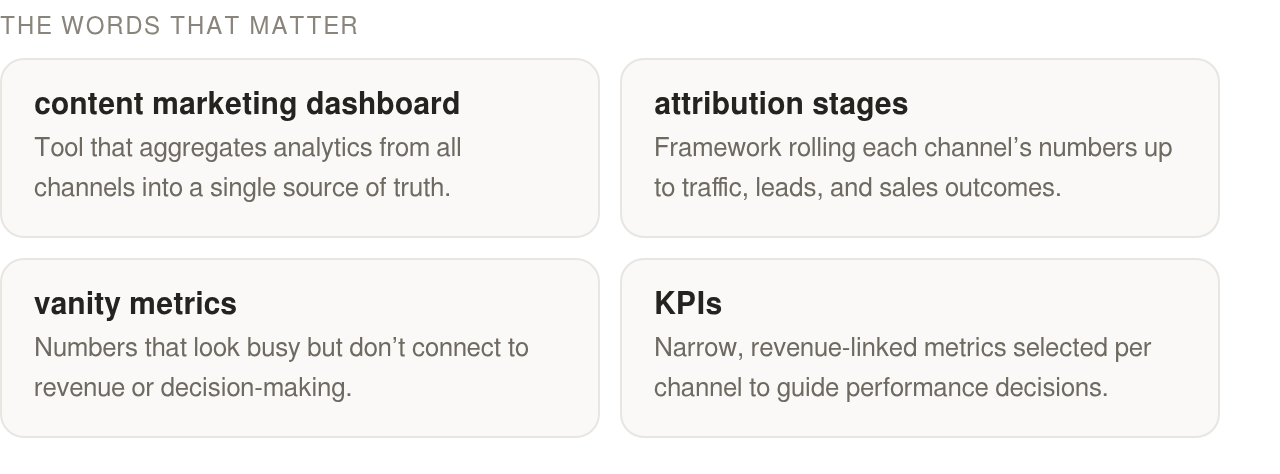
Customized reporting for content optimization fixes that by giving every stakeholder one view. It is built around the outcomes they care about. A content marketing dashboard pulls website analytics, social platforms, SEO tools, email marketing, and your CRM into a single source of truth. Everyone works from the same numbers, and the spreadsheet arguments stop.
Connect widely, display narrowly
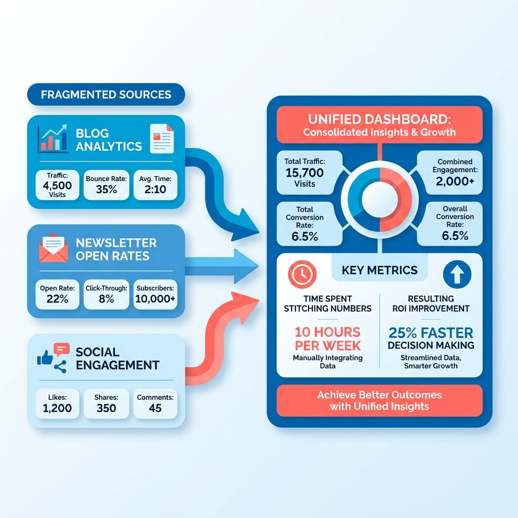
Multi-channel marketing means engaging customers across social, email, PPC, and SEO at once, so a reporting layer has to draw from every touchpoint. But dashboards often go wrong here. Plenty track vanity metrics that never tie back to revenue. You end up with a screen that looks busy and drives no decisions.
These two ideas do not conflict. Ingesting from every channel is not the same as showing every metric. Pull data in broadly, then filter ruthlessly to the KPIs that map to money.
You do not need a report with 50 data points. You need one that shows which content drives traffic, generates leads, and contributes to sales. The rest is noise you can hide from the main view.
Align every channel to the same revenue stages
Blogs, newsletters, and social all speak different native languages. Page views, open rates, and share counts do not compare cleanly on their own. The fix is to organize them around attribution stages: traffic, leads, and sales.
Attribution stages: a shared framework where each channel's numbers roll up to the same three outcomes, even though they start from different metrics.
Map social shares and newsletter clicks to leads generated, and leads to closed revenue, and you can compare a blog post against an email campaign on equal footing. That is where the real optimization decisions get made.
Who actually needs this
Reporting priorities shift by role, so a good framework serves several groups at once:
- Content marketers: track campaign performance and conversion rates to see which content types earn their budget.
- Marketing managers: get a high-level view of how content fits the broader strategy, then report results up to leadership.
- Social media managers: monitor performance across platforms and spot which formats drive the most engagement.
- Executives and stakeholders: understand the ROI of content spend through clear, revenue-linked metrics.
Automation makes this work. Manual data collection costs most content teams hours a week. Once a dashboard consolidates metrics on its own, your people go back to creating content instead of formatting reports. AnyPost pairs this with real-time analytics and Google Search Console reporting that shows you what actually changed, not just what got shipped.
One caveat: if you run a single channel and check it weekly, a unified reporting build is overkill. This pays off when you're juggling blogs, newsletters, and social at once and losing the thread between them. The quick wins come first anyway. Consolidate the data, and you'll usually spot an underperforming asset or a winning format inside the first review.
Selecting and aligning KPIs across channels
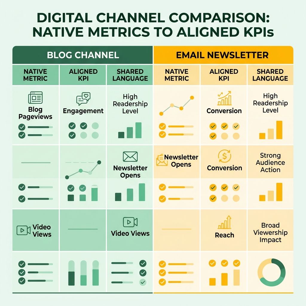
The mistake we see most is treating every channel's native metric as if it means the same thing. A blog pageview, a newsletter open, and a video view are not interchangeable. Good customized reporting for content optimization starts by picking the two or three KPIs that actually matter per channel, then translating them into a shared language everyone reads the same way.
There's a tension worth settling first. Reporting platforms pull many channels into one place, connecting broadly across data sources. Yet a content dashboard guide argues that most dashboards are "cluttered, confusing, and, worst of all, useless" because they track too many vanity metrics. Both are right. Connect broadly at the data layer, but surface only revenue-linked KPIs at the display layer. Integration depth should feed attribution, not clutter.
Which KPIs actually earn a spot per channel
Start with the metrics that tie to a business outcome, not the ones your tools show by default.
- Blog: organic traffic, time on page, and conversion rate. Traffic tracks discovery, time on page tracks whether the content holds attention, and conversion rate tells you if the reader did something useful.
- Newsletter: open rate, click-through rate, and list growth. Opens measure whether your subject lines work, clicks measure whether the body drives action, and list growth tells you if the channel is expanding or leaking.
- Social: engagement rate, reach, and video completion. These vary by platform. A short-form video channel lives or dies on completion rate; a professional network cares more about engagement quality than raw reach.
Resist the urge to pile on. A spreadsheet with 50 data points buries the three numbers that decide your next move.
How to align these metrics across channels
Different channels produce different native metrics, so you need a common backbone to compare them. Organize your KPIs around attribution stages: awareness → consideration → conversion.
Blog organic traffic, social reach, and newsletter list growth all sit at the awareness tier. Time on page, click-through rate, and video completion belong to consideration. Conversion rate and lead generation land at conversion. Now a social post and a blog article roll up to the same outcome, even though their raw numbers look nothing alike.
This ladder also solves the normalization headache. You do not need every channel on an identical scale. You need every channel mapped to the same funnel stage, so awareness numbers get compared to other awareness numbers, not to conversions.
Where teams pick the wrong KPI
The most common mismatch is chasing a metric the channel was never built to deliver. Judge a top-of-funnel awareness post by its conversion rate and you punish content that's doing its actual job. Same goes for grading a bottom-funnel lead magnet on raw reach.
Segment your audiences before you set targets. Blog readers arrive through search intent. Email subscribers already opted in. Social followers are browsing, not shopping. Each group needs a KPI matched to where it sits in your funnel.
Running a SaaS growth motion? Tie each channel goal to a funnel metric your revenue team already tracks. When your content KPIs speak the same language as your pipeline numbers, proving ROI stops being an argument. For teams standardizing this, automated SEO reporting keeps the awareness-tier data flowing without manual pulls.
Building a unified, customizable dashboard
A dashboard that actually gets used starts with knowing where your numbers live. Blog traffic sits in web analytics. Newsletter performance hides in your email service provider. Social engagement scatters across each platform's native API. The point of customized reporting for content optimization is pulling those feeds into one place without drowning the reader in noise.
Here's the trap. Teams connect every source they can find, then paste every metric onto one screen. Broad integration across social, email, PPC, and CRM has gotten easier than ever, which only makes the temptation to display everything stronger. But wide ingestion and clean display are two different disciplines. When a dashboard tries to show everything at once, it turns cluttered and stops being useful to anyone. Both truths hold: ingest widely, display narrowly.
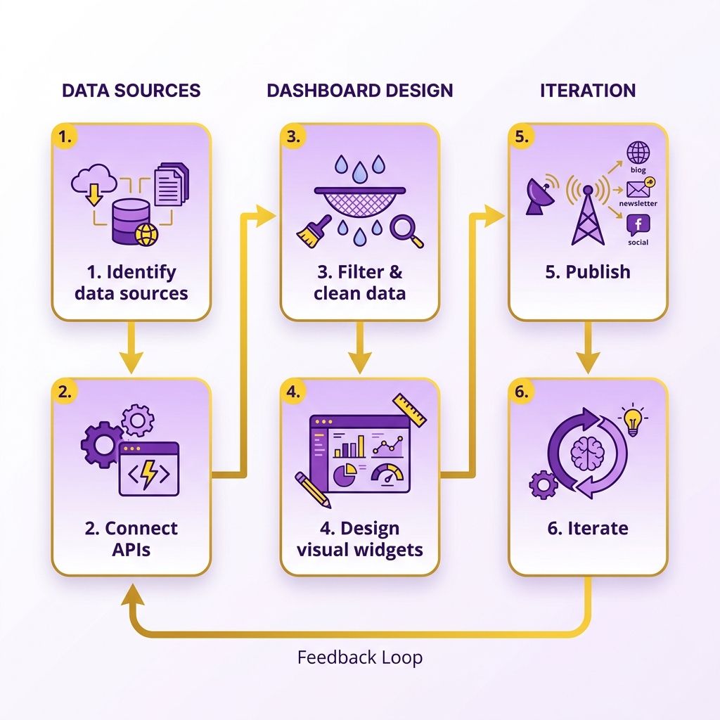
Map your sources before you touch a single widget
Start with a source inventory per channel. For blogs, that's web analytics pulling pageviews, time on page, and traffic origin. For newsletters, your email provider handing over open rates, click-throughs, and unsubscribes. For social, each platform's own API feeding likes, shares, and follower growth.
The mistake is treating integration as the finish line. Connecting a source only earns its keep if the metric it delivers ties back to traffic, leads, or sales. If a feed doesn't map to one of those three stages, leave it out of the display layer entirely.
Modular widgets beat one crowded screen
Build each metric as a toggleable block, not a fixed panel. Your executive wants revenue contribution and lead volume. Your writer wants scroll depth and format performance. Same underlying data, different views, no rebuilding required.
This is where good design earns its budget. Group widgets by attribution stage so blog pageviews, newsletter clicks, and social shares roll up toward the same outcome despite being different native metrics. A stakeholder toggle keeps the C-suite view clean while your content team drills into the granular stuff.
Visual consistency does quiet work here too. Use one color per attribution stage across every channel. Keep iconography identical, so a "conversion" looks the same whether it came from a blog post or a newsletter. When a marketing manager glances at the screen, the pattern reads before the numbers do.
Automate the feed, then guard the door
Manual data collection burns hours a week for most content teams. Automated ingestion from your CMS, email tool, and social APIs frees that time for the work that moves numbers. AI-driven platforms can route content performance straight into a reporting view, so the dashboard updates itself instead of waiting on a weekly copy-paste ritual. If you want to compare configurable options, our rundown of SEO platforms with customized reporting covers the trade-offs.

One caution is worth stating plainly. Every third-party API you connect is a door into your data. Scope each connection to read-only where you can, rotate access tokens, and audit which platforms hold what. Aggregating data across services is powerful, and it also widens your exposure. Treat access permissions as part of the build, not an afterthought once the widgets look pretty.
Structuring reports for different stakeholders
One report format cannot serve a CEO and a data analyst at the same time. The executive wants to know if content is paying off. The analyst wants to know why a specific blog post tanked last week. Both questions are valid, and both need different depth, format, and narrative to answer.
This is where customized reporting for content optimization earns its keep. Build the underlying data once, then reshape how it's presented for each reader. Connect broadly at the data layer, tailor the story at the display layer for whoever's reading it.
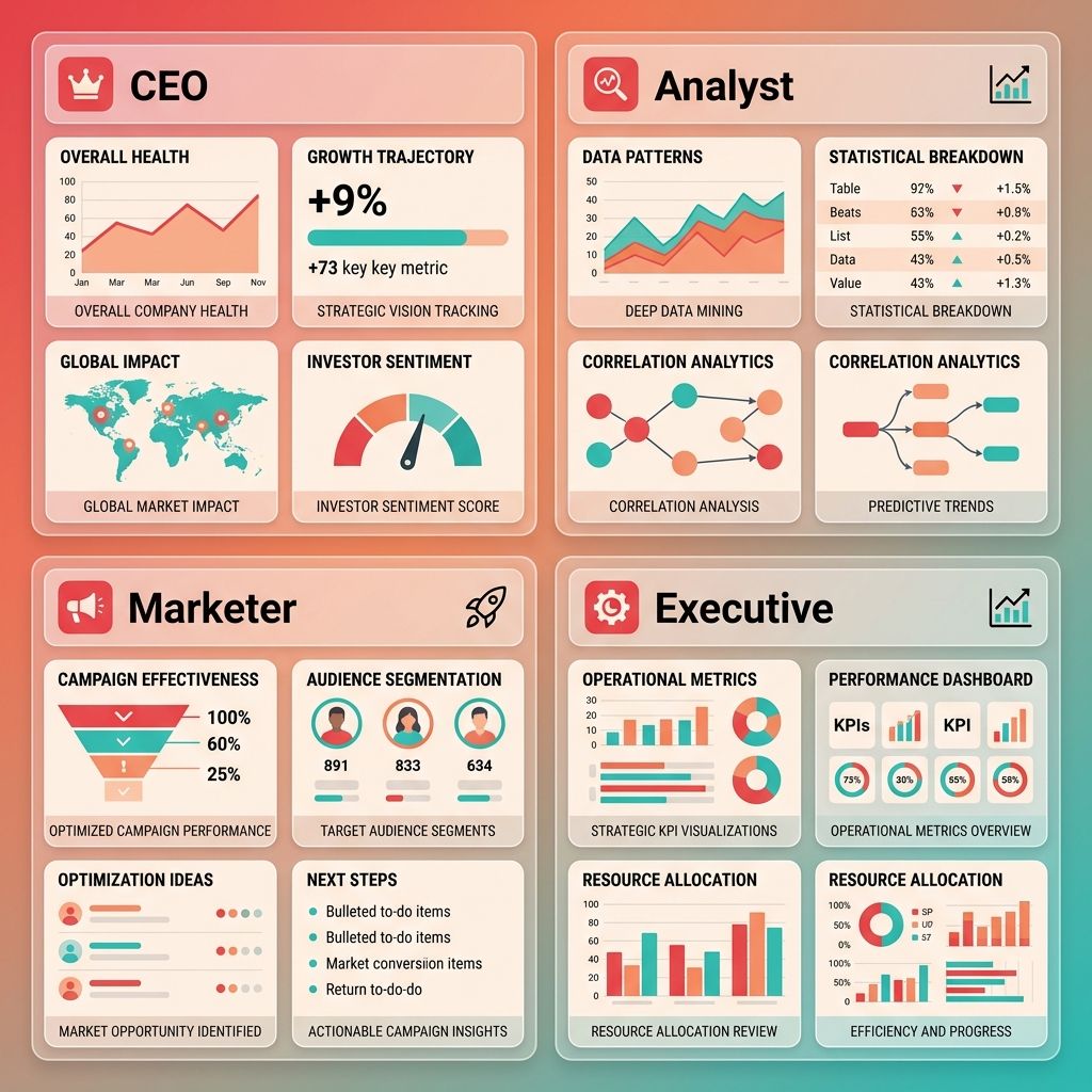
What an executive report actually needs
Executives read for outcomes, not mechanics. Give them a one-pager that answers three things: what content drove revenue, what it cost, and where the trend is heading. High-level ROI and a handful of directional signals. That's it.
The trap here is showing everything. Those "cluttered, confusing, and, worst of all, useless" dashboards are fatal at the executive level. A CEO scanning 40 numbers learns nothing; a CEO reading three revenue-linked KPIs makes a budget decision.
Structure the executive view around attribution stages. Show how traffic became leads and how leads became sales. Blog, newsletter, and social all roll up to that same revenue outcome, even though each has different native metrics. That rollup is the whole point of tying content back to the bottom line.
How deep an analyst report should go
Analysts need the diagnostic layer executives skip. This is where anomaly detection, scroll depth, per-piece conversion rates, and traffic-source breakdowns belong. When a post underperforms, the analyst report should surface the why, not just the what.
A content performance view works well here. It tracks engagement signals like scroll depth, comments, shares, and conversions per piece, which makes it easy to spot high-performing formats and flag the ones dragging your averages down.
Do not sanitize this one. The analyst benefits from seeing bounce rates against CTR, keyword rankings against actual conversions, and organic traffic growth over time. Messy, granular data is a feature at this tier, not a bug.
Where prescriptive insights fit
Descriptive reporting tells you what happened. Prescriptive reporting tells you what to do next. Most reports stop at the first and leave the reader guessing, which wastes good data.
Build simple conditional rules into your content-manager reports. If engagement on a format drops below a threshold, the report flags a test for a different format. If a topic cluster outperforms, it recommends doubling down. These "if this, then test that" prompts turn a passive report into a task list.
Skip the prescriptive rules for your executive one-pager, though. Leadership doesn't want tactical instructions; they want the ROI verdict. Reserve the recommendations for content managers and analysts who actually run the tests. Match the report to the reader, and cross-functional teams stop arguing over whose numbers are right.
Turning data into content you actually change
A dashboard tells you what happened. Your job is to decide what to do about it. That gap between the number and the action is where most content teams stall.
Turning customized reporting into content optimization means reading each KPI deviation as a task, not a data point. A blog post ranking on page two isn't a red cell. It's a rewrite assignment. A newsletter open-rate dip isn't bad news. It's a subject-line test waiting to happen.
The trap is drowning in metrics before you ever act. Teams that check dashboards daily but change nothing burn hours without moving a single result. Pick the two or three metrics that map to a specific action, and let the rest sit until they cross a threshold worth reacting to.
Turning blog data into a content-gap task
Start with keyword performance from your SEO reporting. Pull the queries where you rank in positions four through ten. Those are pages already earning impressions but losing the click.
Each one becomes a concrete edit. Tighten the title tag. Add the missing subtopic a competing page covers. Refresh the intro to match search intent. This is content gap analysis at its most practical: your own report tells you which pages are one revision away from real traffic.
Watch conversion alongside rankings, not in isolation. A page climbing in position but flat on leads needs a stronger call to action, not more backlinks.
What an A/B test for newsletter copy looks like
Tie every subject-line test to your open-rate trend, not a hunch. When opens slide two weeks running, that's your cue to split-test. Send version A to half your list, version B to the other half, then ship the winner to everyone else.
Change one variable at a time. Test length in one round, a question versus a statement in the next. Swap three things at once and you learn nothing about which one moved the needle.
Body copy gets the same treatment. A high open rate paired with a weak click rate points at the copy, not the subject line. That's a rewrite task, and your report just told you where to spend the effort.
Which social format each post should use
Read engagement by format before you decide. Your social report shows which post types earn saves, shares, and comments. Let that pattern pick your next format instead of guessing.
If carousels pull more saves than single images, make more carousels. If a thread outperforms a video on reach, the topic wanted text. The report is a running experiment. Each week's numbers tell you where to lean.
Automating this closes the loop. AI features that read your performance data can flag which pages to refresh and suggest copy tweaks before you go hunting. That turns your dashboard from a rear-view mirror into a task list you work through every Monday.
Skip heavy testing on channels with tiny volume. If a newsletter goes to 200 people, an A/B split will not reach significance. Use judgment there, and save the rigor for lists and pages with real traffic.
Automating reports and keeping them sharp
Manual reporting is where good intentions go to die. You promise yourself you'll pull the numbers every Monday, and by week three you're copy-pasting from five tabs at 11pm. Automation is what makes customized reporting for content optimization actually stick, because the report builds itself whether or not you remember it exists.
The setup is straightforward. Schedule data pulls from your web analytics, your email service provider, and each social platform's API on a fixed cadence. Then route the finished report to the people who need it. Do this once, and reporting stops being a chore and starts running in the background.
Scheduling and distributing reports automatically
Pick a cadence that matches how fast each channel moves. Blog and SEO data can run weekly, since rankings shift slowly. Social and email deserve a tighter loop, because a subject-line flop or a post that flatlines is worth catching within a day or two.
For distribution, match the format to the reader. A short email digest works for stakeholders who skim. A Slack notification fits teams that live in chat and want the number where they already work. A PDF export suits the monthly leadership review that gets forwarded around. Same underlying data, three delivery paths, zero manual assembly.
What alerts should trigger immediate action
Scheduled reports tell you the story on a delay. Alerts catch the fires while they're still small. Set threshold rules on KPIs that actually drive revenue, and let the system ping you the moment one crosses a line.
Keep the trigger list short. A traffic drop past a set percentage. A conversion rate falling below your floor. A suddenly spiking bounce rate. Each alert should map to a clear next move, not just a notification you learn to ignore. If an alert doesn't change what you do that day, delete it.
The goal is separation of concerns. Routine reports handle the trends. Alerts handle the exceptions. Blur the two and you either drown in noise or miss the thing that mattered.
Keeping reports from rotting into wallpaper
A dashboard built six months ago is answering last quarter's questions. Set a quarterly review to prune metrics nobody reads, add the ones you keep exporting by hand, and redesign visuals that confuse more than they clarify. This is the "continuous" half of continuous improvement, and skipping it is why so many dashboards decay into wallpaper.
Treat your report templates like code. Keep a documented version of each so you know what changed, when, and why. When a KPI definition shifts or you swap a chart type, note it. Otherwise you'll spend a review meeting arguing about why last month's number looks different from this month's.
One honest limit: don't automate a report nobody has agreed to read. Building slick scheduled digests for a stakeholder who never opens them is wasted effort. Confirm the audience and the questions first, then automate the answer, and let the feedback from each review sharpen what the next version measures.
Common Questions
Should a small business with just one blog invest in a unified reporting dashboard?
Skip it if you run a single channel and check it weekly. A unified build is overkill at that scale. Unified reporting pays off when you juggle blogs, newsletters, and social at once and keep losing the thread between them. The consolidation itself often reveals an underperforming asset or winning format inside your first review.
My blog post ranks well but generates no leads. What does the data say I should fix?
Ranking measures discovery; conversion measures whether readers act. When you see this split, treat it as a copy or CTA task rather than an SEO one, and watch conversion alongside rankings instead of in isolation.
Why can't I judge a top-of-funnel blog post by its conversion rate?
Judging an awareness-tier post by conversion punishes content doing its actual job. Blog readers arriving through search intent sit at a different funnel stage than opted-in subscribers or browsing social followers. Match each KPI to where the audience sits—reach and traffic for awareness, conversion rate only for bottom-funnel assets like lead magnets.
My newsletter only reaches 200 people. Is A/B testing worth running?
Skip heavy testing on channels with tiny volume. A 200-person newsletter will not reach statistical significance in an A/B split, so the results will not tell you anything reliable. Act on judgment for small lists and save the testing rigor for lists and pages with real traffic where the sample size can actually support a conclusion.